On the train home from work yesterday, I watched a podcast of PhotoshopUser TV on my iPhone. Sorry, I just couldn’t resist throwing that in. Anyway, I did watch an episode on the train and when I got home I tried one of the tricks Matt demonstrated. The trick was to create the look from the movie 300. The movie had a gritty look to it, the color red was emphasized and it had an overall gold/bronze color cast to it. Matt showed that the effect could be used on any photo and how you could make minor adjustments to each image.
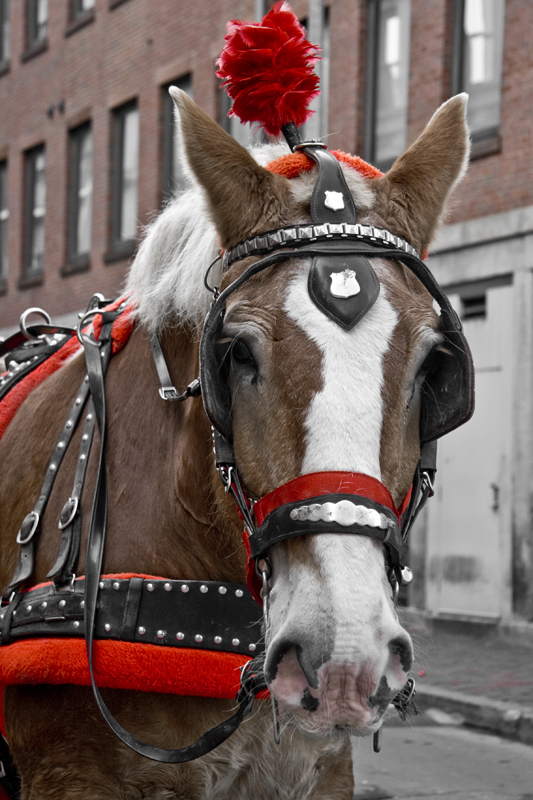
I decided for today’s post I would experiment with the effect. I removed the gold color cast and just stuck with emphasizing the reds. That worked well for this image since there is so much red in it (including the brownish red of the horse’s hair). The trick to make the image gritty ended up making the hair on the horse much sharper and pulled out more texture. You can really notice it on the horse’s chest.
While I’m not as likely to get right up in someone’s face to take a photo, I have no problem doing it with animals (well, calm animals). This guy (or girl) was very good about posing for me. Notice how he’s starring right at the camera. Of course he has blinders on but that’s beside the point.


Chris
Great shot, so why the long face?
Jamie
Ha, Ha.
Shirley
You have an iPhone?!
Nice experimenting and explaining. I really noticed the horse’s nose. The wrinkles are so clear and the pink made an impression on me. Was the pink brought up front more as part of the red being pulled up?
Jamie
The pink may have been brought up a tiny bit but not too much. I think the clarity of the wrinkles might make it more noticeable.